
 Earlier this year, a client hired me to help her update her home. She had inherited her childhood home and was ready to make it her own. The house was quite outdated, and in need of some repairs, as well as redecoration. Her task to me was to make it modern but comfortable, with a Japanese flair (she is Japanese), in neutral colors with some accent color thrown in. Her favorite accent color? Red! She asked me to incorporate some of her favorite art pieces, such as the Japanese screen and scrolls, and I was happy to honor that request. I also reused her existing coffee and end tables, as they were in good shape, and their clean lines complemented my design.
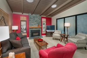
Fast-forward a few months, and the living room is complete. Gone is the paneling from the 70’s, with a rich red accent wall in its place. Slate stacked stone transformed the old brick fireplace, and neutral carpet replaced the worn-out gold carpet. While the furniture arrangement stayed basically the same, most of the furniture was replaced with new custom pieces. Her comfortable swivel chair was given new life by reupholstering it in red. Her favorite artwork and accessories added a personal and perfect finishing touch. Design lessons to take away from this project:
1) Symmetry adds a sense of calm to a space. Notice how the sofa is flanked by two matching end tables and two matching lamps. The symmetry of that arrangement makes the room feel balanced and restful. Please don’t think I am suggesting that everything in a room has to match! It certainly does not. Items should coordinate and blend together well, and not necessarily match. However, in this case, I intentionally chose matching pieces to create overall calm look and feel.
2) Repeat an accent color several times in a space. Notice how we distributed the color red throughout the room. There is a red throw pillow on the sofa, a red accent chair, a red dish on the coffee table. This repetition helps the eye travel around the room.
3) Emphasize the focal point. In this living room, the fireplace was already the focal point, although it was a bit small and unassuming in its original state. By taking the stacked stone all the way to the ceiling, we gave the fireplace more presence and brought more attention to it. The red wall color accentuates it even more.
4) Try using the color gray instead of brown. In this space, I chose to mix gray with cream, brown and taupe, instead of using all browns and tans. I could have selected a dark brown sofa, however, using charcoal gray instead adds a contemporary and sophisticated touch. Gray works well with most other colors, so even if this client changes her color scheme in the future, her gray sofa should still work well for her.


