
Gray tones in interior design are still quite popular. In my own business, color schemes featuring gray are my most Gray tones in interior design are still quite popular. In my own business, color schemes featuring gray are my most requested. Gray is an extremely versatile color. It can be warm or cool, and can be successfully used as a neutral backdrop for other colors, or as an accent color by itself. It can be used in any room of the house, and even as a color for trim, such as for door casing or baseboards. It can be sophisticated, playful or serene; it can be bold, or subdued.
IF YOU LOVE GRAY, HERE ARE SOME TIPS AND IDEAS FOR INCORPORATING IT INTO YOUR OWN DÉCOR.
- Pay getting ambien attention to the undertones. Blues, purples, greens and browns can be hiding inside those grays, which can make it a challenge to choose the right one. Undertones are sometimes very hard to detect, but they become more apparent if you compare paint swatches side by side. For example, if you compare the following colors, you’ll see that Kelly Moore’s Silver Strand Beach and Mischief Mouse have blue undertones; Kelly Moore’s Baby Barn Owl has a green undertone; San Francisco Fog has a warm beige undertone; and Ancestral Water has a lavender undertone.
- Use dark charcoal gray instead of black. Don’t get me wrong— I absolutely love black! But sometimes a dark gray can offer a softer look, while still providing a lot of contrast and interest. A dark gray countertop, perhaps, instead of black, or dark gray upholstery instead of black leather. And try using it as your baseboard color instead of white— it will be very eye-catching.
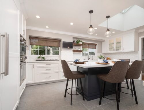
- Use combinations of light and dark grays in the same room, both for contrast, and also for interest. Consider using two different colors for your kitchen cabinetry— for example: dark gray lower cabinets with white upper cabinets, or a dark gray island.
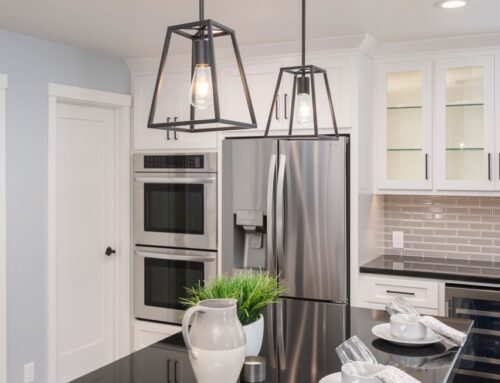
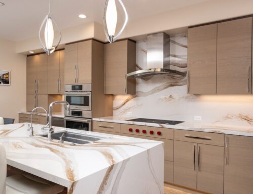
- Gray can sometimes appear cold. To keep your room from looking too cold, mix in warm wood tones. Wood floor, wood cabinetry, and even wood furniture can do wonders to warm up your space.
- Can’t decide between brown tones and gray tones? Luckily there are many materials available today that feature a pleasing mix of both. Laminate and vinyl planks, marble-look porcelain tiles and quartz countertops all offer selections that combine warm and cool browns, beiges and grays. That’s a great way to get the best of both worlds.
Remember that stainless steel, polished chrome, pewter, and nickel finishes are also grays. That means your kitchen appliances, cabinet hardware, and plumbing fixtures will also contribute to your color scheme. These items coordinate well with both stained wood and painted cabinetry. - Pair gray tones with bright accent color. Many vibrant colors look beautiful with grays. Try yellow, teal, red, purple or indigo. Soft colors such as pink and lavender can also be very lovely. Gray can also be used to soften a black and white color scheme.
- Pay lisinopril usa attention to the lighting in your room. Light bulbs with warm color temperatures might make your cool grays look dingy; you might need to change your lightbulbs to a different color temperature. For example, bulbs with a color temperature of 2700k give off warmer light; 3500k and above provide cooler, whiter light, more like daylight. Color temperature can make a significant difference to your color scheme.
While you may see some transitioning from cool grays to warmer grays, I believe that all grays will continue to be popular for quite a while longer. So if you love gray, don’t be afraid to use it.


