
As long as I could remember, blue has been my favorite color. I love all shades of blue, but in particular, I love deep, intense blues like navy, royal, and cobalt. Blue is an amazingly versatile color, perhaps because it is the color of the sky and the ocean, which coordinate with just about every other color around. Throw on a pair of blue jeans, and you can wear any color top with them. So imagine my delight when the Pantone Color Institute, a very influential company in the world of color and design, selected Classic Blue as the color of the year for 2020.
get xanax online
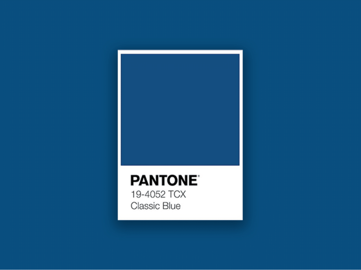
In color psychology, blue is the color of stability, order, and reliability. It exudes feelings of serenity, calmness, and tranquility. An intense color like Classic Blue, however, can also evoke feelings of energy and strength. Blue is described as a favorite color by most people. In selecting the color of the year, Pantone and other color forecasters look thoughtfully at global societal influences such as art, media, entertainment, socioeconomic and political conditions, travel destinations and technology.
xanax
According to the folks at Pantone, “We are on the precipice of entering into a new decade and are desirous of a stable and strong foundation to help us go forward. Yet at the same time, many around the world are feeling unsure and as though the ground beneath them is continually in flux. Pantone 19-4052 Classic Blue, a solid and dependable blue hue, expresses trust, faith and constancy, as well as offering protection—qualities that provide us with the reassuring presence and feelings of calm and confidence we crave as we cross the threshold into this new era.”
phentermine
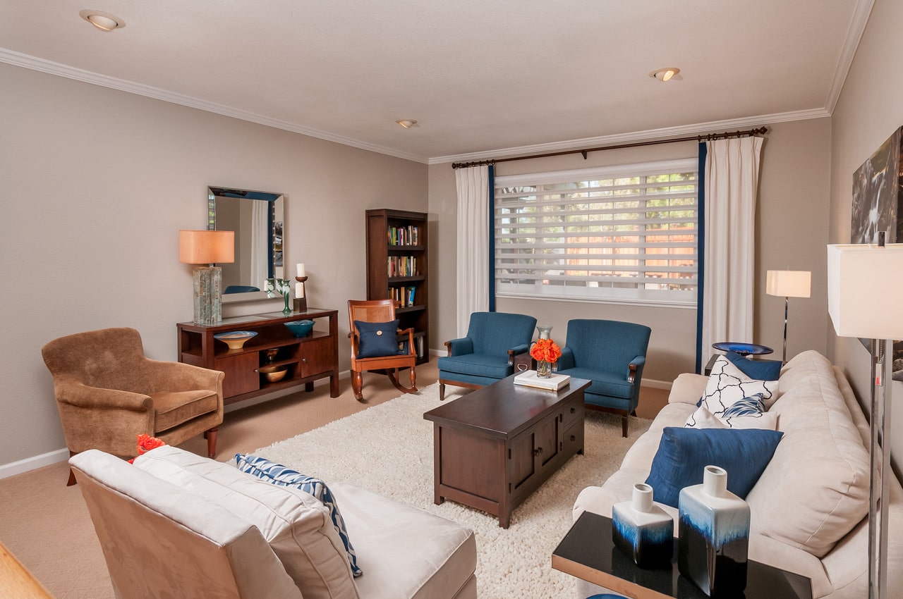
Maybe it’s the feeling of strength and stability, or maybe I just like the color. But whatever the reason, I have blue running throughout my own house, and have also used it in a few of my design projects. The selection of Classic Blue as color of the year means you will be seeing it all over the place; in fabrics, wallpaper, home furnishings, clothing, even in consumer goods like electronics and appliances. If you like blue as much as I do, consider using it in your home as well.
modafinil
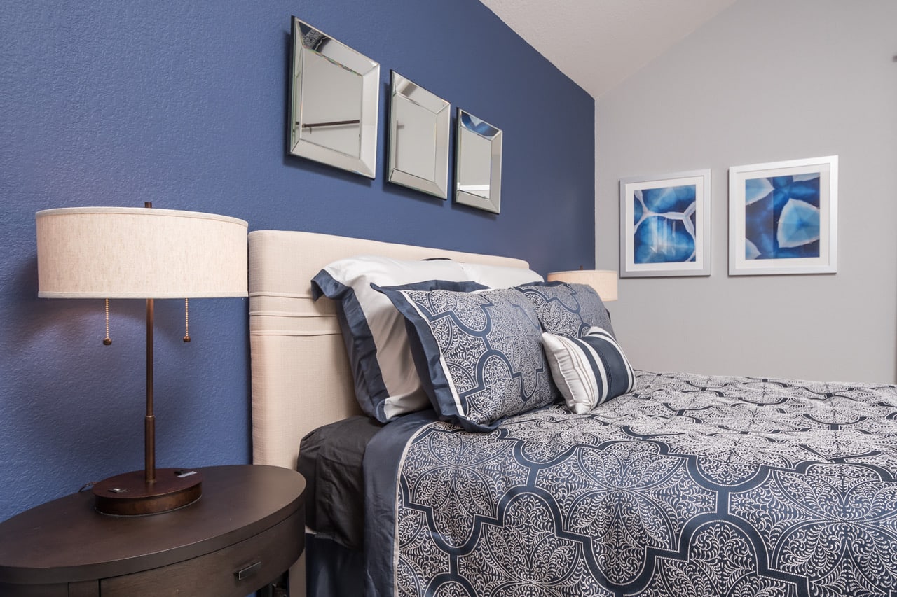
For some, Classic Blue will be too intense to use as a wall color, but I challenge you to try it. Note the bedroom that features Navy as an accent wall behind the bed. And take a look at my headshot on the “About” page of this website— notice the blue wall behind me? That’s actually my own kitchen! I had it painted several years ago, and I still love it!. I also have Cobalt Blue glass tiles on my kitchen backsplash— in 15 years I have never gotten tired of them. I recently added some smoky blue glass tiles to my fireplace, and I love those too.
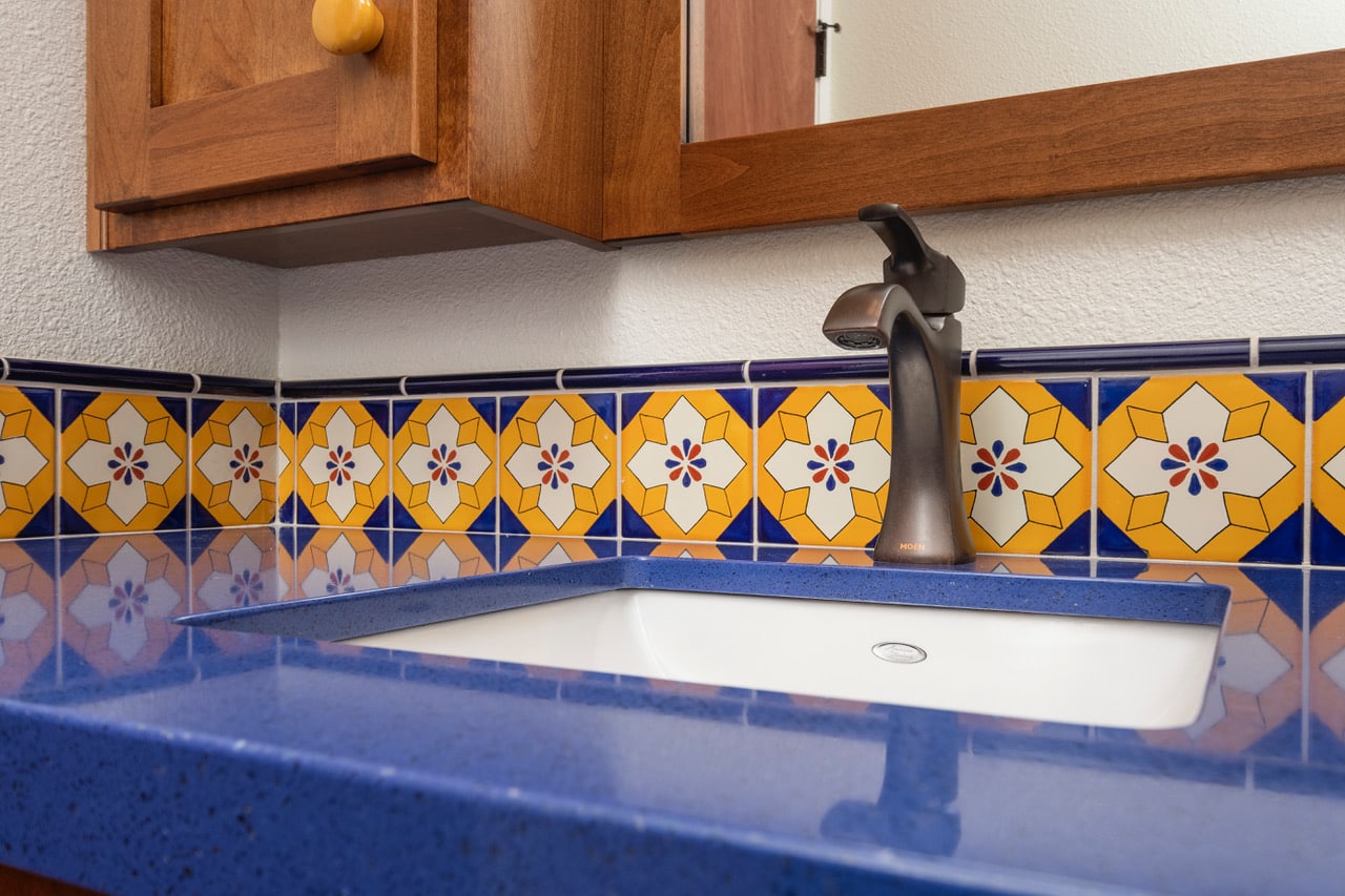
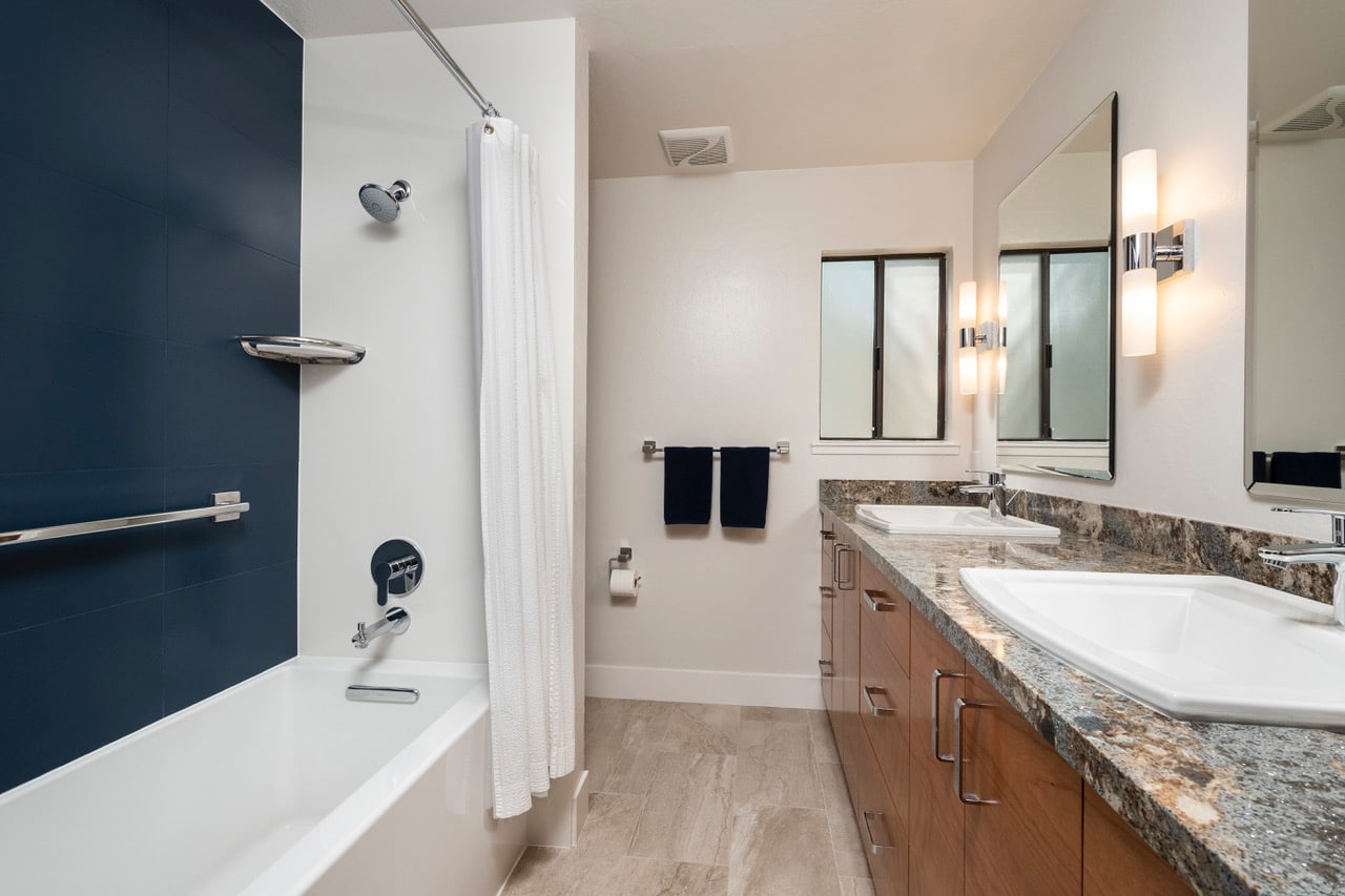
Another way to bring in deep, rich blue would on your countertops. Search on Google for a Cambria Quartz countertop called Hadley. Hadley is a gorgeous Navy Blue— I have not used it in a project yet, but I am dying to. Bala Blue is a brighter, more fun and energetic blue, shown in the bathroom photo below.
For many people, it will feel more comfortable to use Classic Blue in smaller doses. Try pillows, or an area rug, or a new sofa or chair. Or look for bedding, draperies or artwork. Blue is a classic color that does not go out of style; a versatile color that works equally well in traditional, transitional and contemporary styles.
