
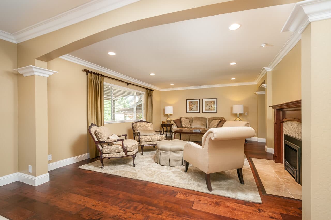
How do you feel when you walk into a red room? How about a green room? You’re not alone if you feel calmer surrounded by blues and greens, or more confident when wearing black. The subject of color psychology is fascinating. As we all might guess, color can have a profound effect on our mood, whether it’s in something we wear, or in our homes.
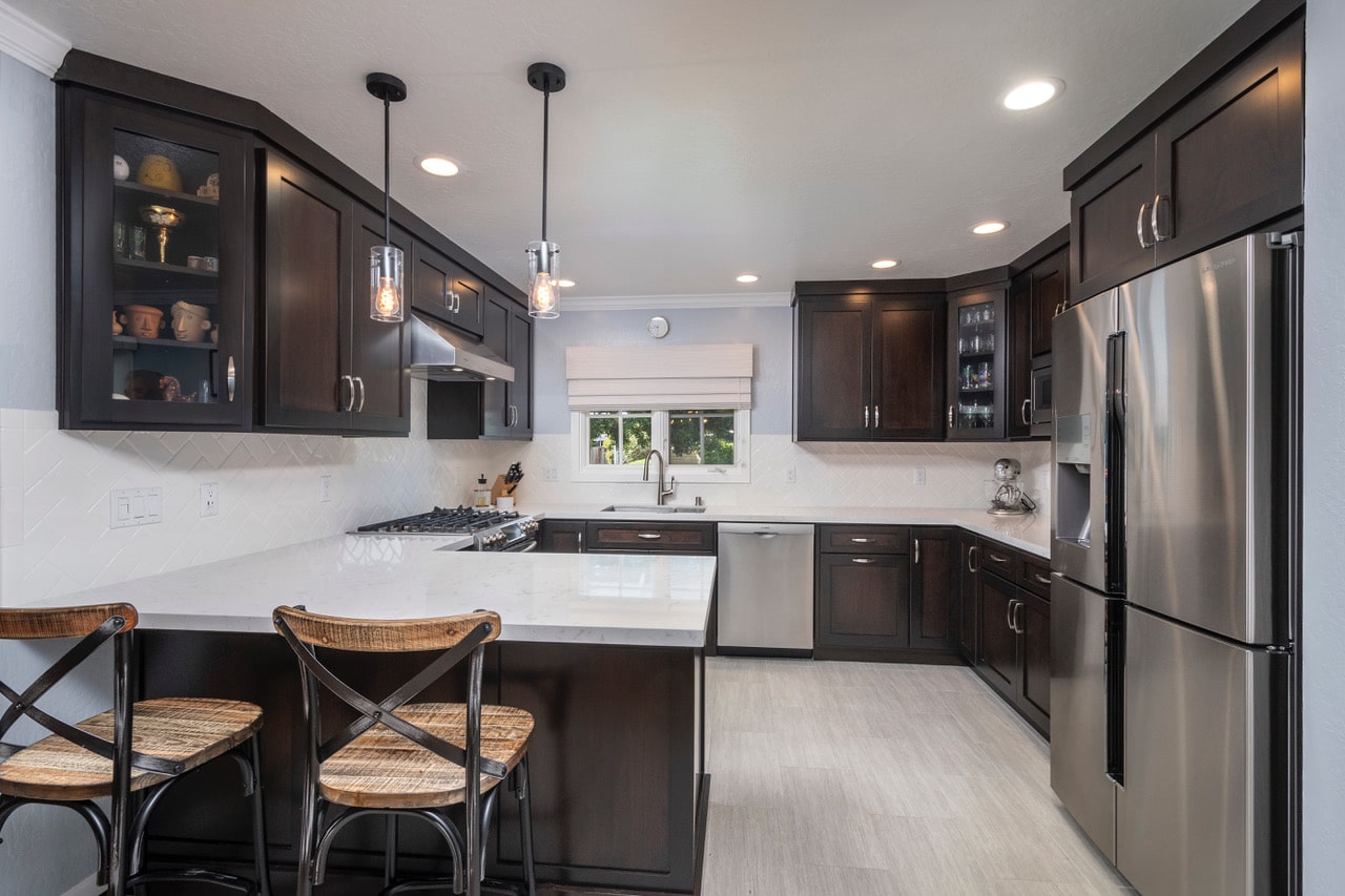
Red—exudes excitement and energy, and it makes a bold statement wherever it goes. Think of a bright red sports car or a dozen red roses. In addition to stimulating appetites, red has been known to improve one’s sense of smell, as well as cause other psychological responses such as increased heart rate and rapid breathing. Red provides a jolt of energy and life. Just look at this kitchen! I was happy when these clients took my suggestion of red as their wall color—it adds so much punch to all the gray and white. Other energetic colors in the red family are fuchsia and magenta. If these colors are too intense for you, try burgundy or brick red, which are still bold, but a bit more subdued.

Orange—is associated with warmth, happiness, whimsy and playfulness. Like red, it is also an appetite stimulant, and because of its energy, it also attracts attention, waking up any room. As the complement of blue on the color wheel, it is a great accent color to pair with navy or cobalt blue. Other colors in the orange family are copper and terra-cotta. Try combining copper with turquoise or purple for a very beautiful color scheme.
Yellow—is cheerful and outgoing, and a particularly wonderful color for rooms with no windows or natural light. Closets, small bathrooms and laundry rooms come to mind as spaces that could benefit from this warm and friendly color. Yellow can remind us of nature, as in golden sunsets, lemons and daffodils, or elegance and prestige, as in gold jewelry or gold leaf.

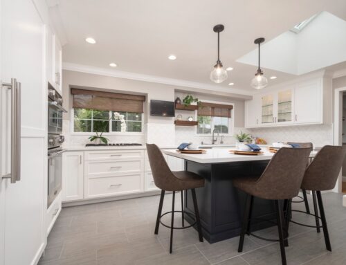
Green—is a restful color, and, because of its ubiquitous presence in nature, can even act as a neutral, allowing other colors to play off of it. Dark greens tend to be masculine, traditional and can even imply wealth. Earthy greens like moss and sage are quiet and soothing. And bright greens, like in Granny Smith apples and limes, are playful and fun, especially when combined with tangerine orange, aqua blue or lemon yellow. Dark green looks beautiful paired with burgundy red (think vineyards and a glass of Pinot Noir). And mossy greens combine well with mustard and brick red.
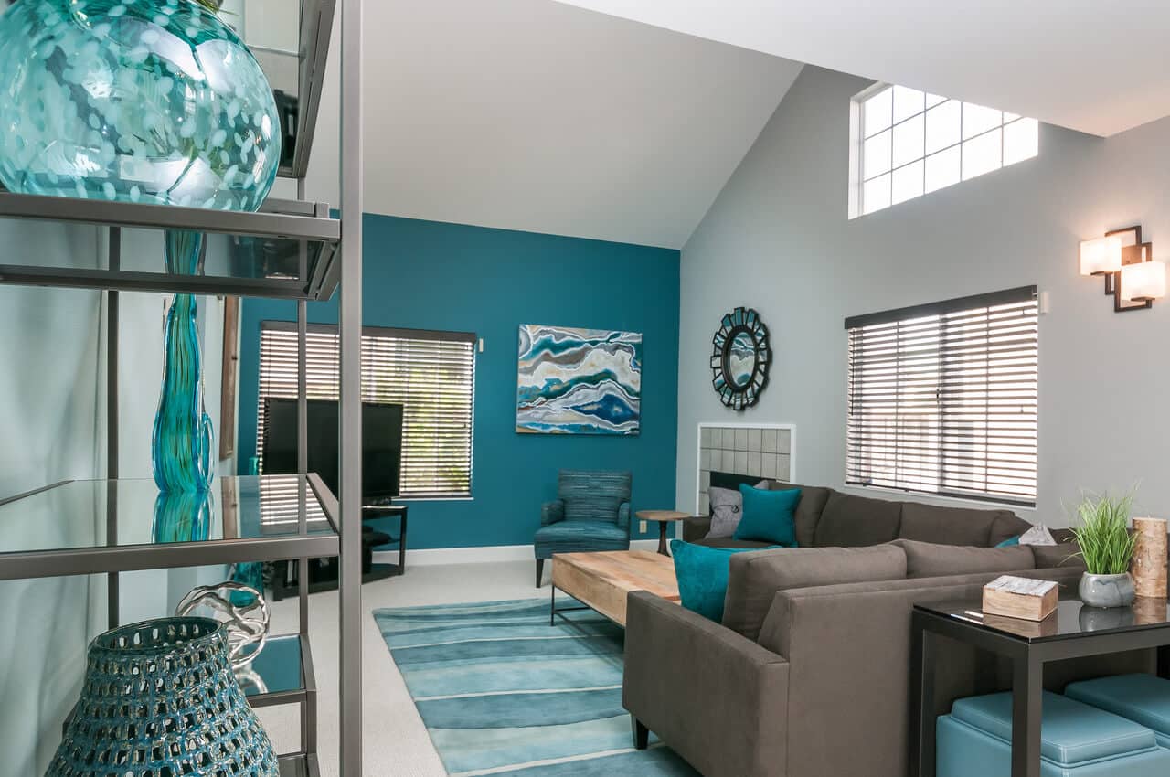
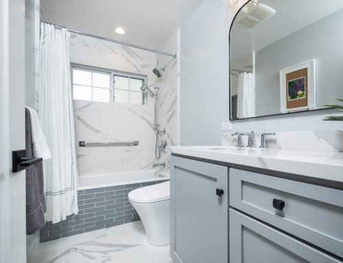
Blue—is named by most people as their favorite color (including yours truly!) The color of the sky and the ocean, blue is calming and peaceful. Blue is a wonderful color for bedrooms, and really any room in the house. Lighter tones can be almost ethereal (great when you’re designing a spa-like bathroom for example); darker blues can be formal (think navy blue velvet with gold trim) or casual (think of your most comfy pair of blue jeans.) In the world of color psychology, the color blue exudes professionalism and dependability. Business consultants often recommend wearing navy blue suits, and many professional uniforms are also blue.


Purple—combines the vibrancy of red and the tranquility of blue. Historically, purple has been the color of royalty, and it connotes wealth and luxury. Purple is also associated with the exotic and mystical. Red-purple is sensual and exciting. Eggplant and plum are regal and elegant. Lavender is delicate and sweet.
