
 Interestingly, Benjamin Moore named “Simply White” their color of the year for 2016. Other paint companies like Sherwin Williams, Behr and Gladden have also listed versions of white in their their forecasts for 2016 and going forward. Why white? It’s part of a larger societal trend favoring simplicity and timelessness. White is recognized as a fantastic backdrop color— one that sets the stage for everything else that will be happening in the room.
 White and all of its many iterations can be terrific wall colors— white with a hint of yellow, pink or peach can add so much subtle warmth to a space, while white with slight undertones of blue or green can cool off a room. White also sets off other colors beautifully— think of crisp white crown molding or a fireplace mantel contrasting with the deeper wall color behind it. But white is not just for trim and moldings— furniture, walls, window treatments, tile, and cabinetry all look terrific in tints, tones and shades of white.
Using white in your interior design allows you to be more adventurous with the other colors in the space. In one recent project, the client loved bold colors like purple, red and cobalt, so we used crisp white on most of the walls, then used those bold colors strategically on accent walls and even some ceilings to create a modern, “art gallery” type of look.
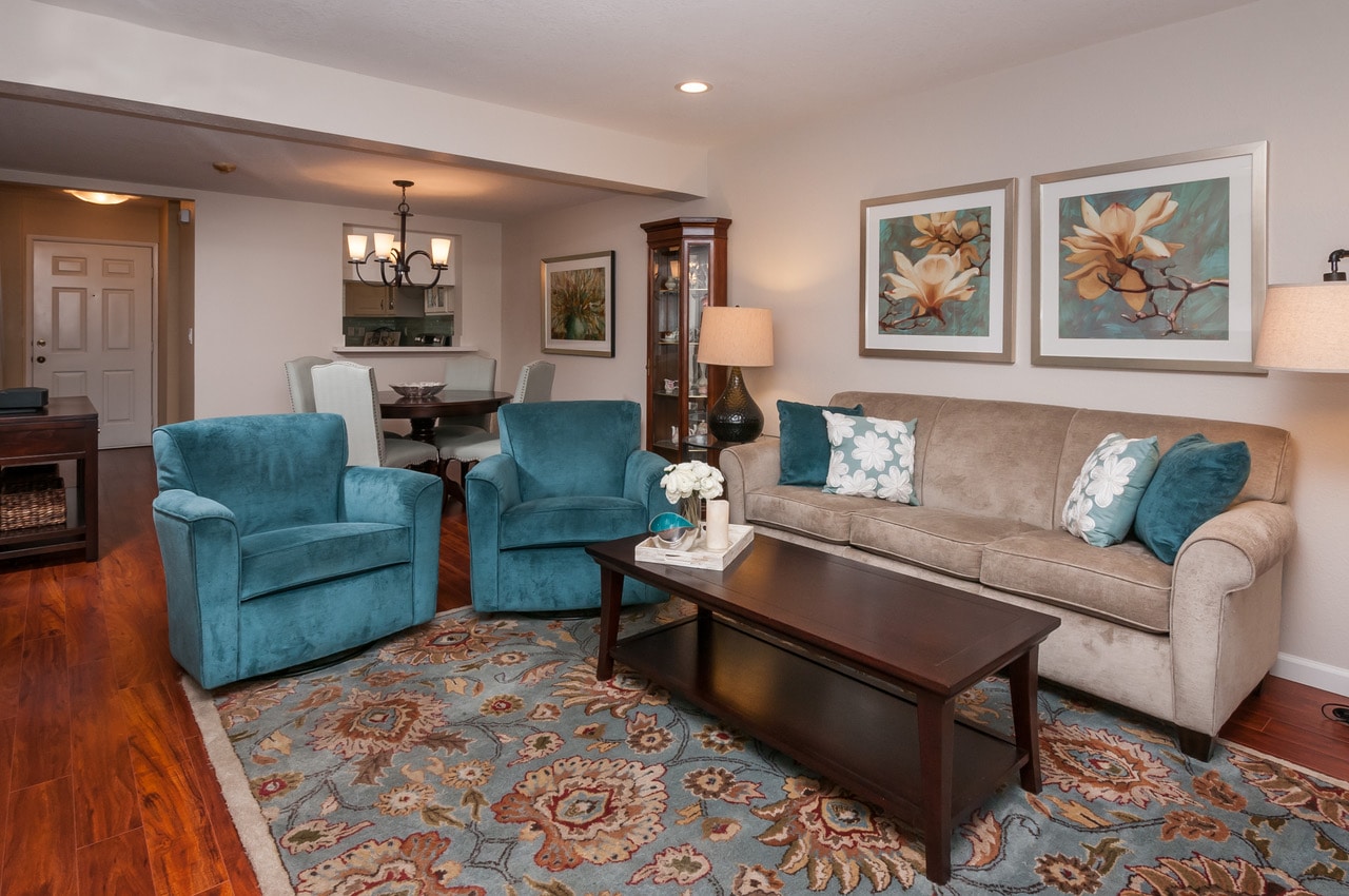
If you want a mix of colors, but don’t tend to like bold, bright hues, use white and creams, paired with light grays and tans to create a very elegant and restful interior. In another project, we used a variety of whites, creams and other soft neutrals for the fireplace mantel and tile, the finish on the chairs, the upholstery fabric, window treatments and area rug. The result is a beautiful, inviting living room that will stand the test of time.
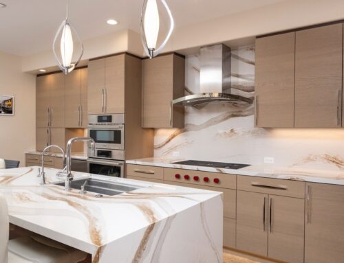
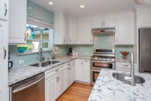 White kitchen cabinets are hugely popular right now, as they coordinate with almost any other color and work in almost all design styles from contemporary to traditional. In this kitchen, the crisp white cabinets coordinate beautifully with the aqua blues in the backsplash tile and the quartz counters, while the wood floor and island add warmth and contrast to the space.
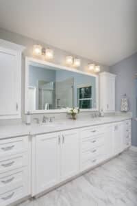
 And there’s no way to go wrong with a white bathroom. White tile always looks clean and fresh, and you can add a lot of personality with wall color, window treatments, art and accessories.
Some advice to clients who are afraid of color: if you’re defaulting to white for your walls because you are afraid to take a leap and try color, please get over that fear! Most people love colorful interiors when they see them, and just need a nudge to try something new. That said, if you are intentionally choosing white for your interior design, then go with it wholeheartedly and don’t let anyone make you feel bad about it. If white is the color of the year for 2016, then you know you’re in great company.
